| Author |
Message |
|
|
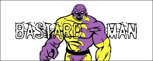
-BASTARD - MAN-
|
 Posted: Wed Jul 09, 2008 10:40 am Posted: Wed Jul 09, 2008 10:40 am |
 |
|
 Low Tolerance Low Tolerance Joined: Wed Feb 20, 2008 11:36 amPosts: 216Location: BREAKING THE FUCKING LAW Joined: Wed Feb 20, 2008 11:36 amPosts: 216Location: BREAKING THE FUCKING LAW
|
IT LOOKS MORE EVIL AND OPRESSIVE THAN THE OLD DESIGN, AND THEREFORE IT GIVES ME AN EVIL STIFFY. WELL DONE.
_________________
THE GREATEST SUPERVILLAIN TO HAVE EVER LIVED
 |
|
|
Top
|
 
|
|
HavocClaudia
|
| Posted: Wed Jul 09, 2008 6:40 pm |
|
|
 Highly Intolerant Highly Intolerant Joined: Tue Sep 07, 2004 9:35 amPosts: 1668Location: Chester, UK Joined: Tue Sep 07, 2004 9:35 amPosts: 1668Location: Chester, UK
|
Who turned out the lights??
Haha nah really tis looking good, better with the links to the rest of the site as well.
_________________
DIAMANTHIAN - http://www.myspace.com/diamanthian
Belly Button: HavocClaudia: She singlehandedly* prevents this forum from transforming into a colossal Tetsuo shaped mound of phalluses, and has extremely trve metal taste. |
|
|
Top
|
|
|
Leon_ZT
|
| Posted: Thu Jul 10, 2008 12:47 am |
|
|
 Site Admin Site Admin Joined: Mon Jul 05, 2004 5:46 pmPosts: 532Location: England Joined: Mon Jul 05, 2004 5:46 pmPosts: 532Location: England
|
|
|
Top
|
|
|
Best - Man
|
| Posted: Fri Jul 11, 2008 12:20 pm |
|
|
 Highly IntolerantJoined: Thu Nov 11, 2004 7:36 pmPosts: 4470Location: Fighting crime Highly IntolerantJoined: Thu Nov 11, 2004 7:36 pmPosts: 4470Location: Fighting crime
|
To be honest, while it looks a lot more organised and while it's cool that it's all custom designed and what not, I prefer the look of the old one if only because it was easier on the eyes.
Not to shit on the work that's gone into the new design, I mean. I really like this look, just saying I miss ye olde red and white already!
_________________
The Best Superhero In The Entire Universe

 |
|
|
Top
|
|
|
alexyork
|
| Posted: Fri Jul 11, 2008 12:31 pm |
|
|
 StaffJoined: Thu Jul 22, 2004 6:38 pmPosts: 1008Location: UK, London StaffJoined: Thu Jul 22, 2004 6:38 pmPosts: 1008Location: UK, London
|
colour-on-colour is always a huge issue in design.
black on white is actually (physically) the most "disturbing" to the human eye, because of the contrast with black and white being at complete opposites of the spectrum. grey as a background is generally considered by scientists and artists as the ideal, since it's completely neutral - therefore any overlaid colour complements it comfortably. the red continues the theme, as white on red is both visible yet still "relaxed" enough not to disturb the eye. this is why most compositing software packages have neutral grey backgrounds (so images overlaid within it are not visually too bright or dark in comparison).
if you've ever seen those illusion images on the net which fool you into thinking an image is brighter than it's counterpart, when in fact they are identical (because the backgrounds are different brightnesses and shades), you'll know what I mean.
I think after extended use on this forum you'll get used to it and actually find it more readable than previously - although you have nothing to compare it to now so that's a moot comparison!
of course everyone's eyes are different (and monitors, crucially - some screens are VERY bright compared to others), it's just a case of trying to cater for as wide a viewing public as possible, which I think we've managed here.
|
|
Top
|
|
|
Belly Button
|
| Posted: Fri Jul 11, 2008 4:08 pm |
|
|
 Zero ToleranceJoined: Sun Jul 09, 2006 7:18 pmPosts: 6315Location: Landscape XX Zero ToleranceJoined: Sun Jul 09, 2006 7:18 pmPosts: 6315Location: Landscape XX
|
_________________
 |
|
|
Top
|
|
|
alexyork
|
| Posted: Fri Jul 11, 2008 4:31 pm |
|
|
| StaffJoined: Thu Jul 22, 2004 6:38 pmPosts: 1008Location: UK, London
|
belly, you should always leave monitor contrast at 100%, but vary the brightness to your taste. at 100% brightness colours will be faithful, at lower values whites will appear shades of grey. This is a relative shift, so not that important, but has a huge impact on calibrated monitors (which I imagine yours is not). but definitely leave contrast at 100% - if you don't blacks and whites will not be faithful - images you produce/edit may appear much much brighter on other monitors that are properly set up or (hopefully) calibrated. then there's printing... which is another pain in the arse. this has little to do with people's aversion to certain colours really, but that comes into it a little I guess. same ball-park  absolutely, red is associated with either danger or lust/passion, neither of which are things most shop owners wish to invoke in their customers!
|
|
Top
|
|
|
PaulRawNerve
|
| Posted: Tue Jul 22, 2008 2:52 pm |
|
|
Intolerant Joined: Fri Oct 01, 2004 8:31 pmPosts: 638Location: Leeds, the centre of the Universe Joined: Fri Oct 01, 2004 8:31 pmPosts: 638Location: Leeds, the centre of the Universe
|
really like the new look, it's well neat. good skills. 
_________________
Leeds, May 2/3/4 2014 - 'kin Hell Fest - w/ Napalm Death, Anaal Nathrakh, Onslaught, Massacre, Lock Up, Pentagram Chile, Wodensthrone, Birdflesh, Desecration, Malignancy +32 more - 42 bands £59 (£22.50 day tickets) - http://www.kinhellfest.bigcartel.com |
|
|
Top
|
|
|
OrionMetalhead
|
| Posted: Mon Jul 28, 2008 5:10 pm |
|
|
 Highly IntolerantJoined: Mon Oct 02, 2006 9:07 pmPosts: 3292 Highly IntolerantJoined: Mon Oct 02, 2006 9:07 pmPosts: 3292
|
Good jorb Mr. York.
|
|
Top
|
|
|
|


